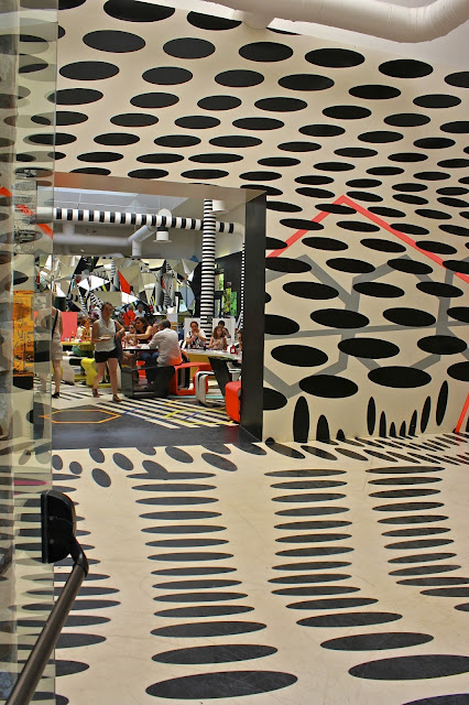
It is amazing the impact that simple paint, (or one dimensional stick-on decals), can have on a space - but that is the power of good design. I recently visited the Venice Biennale and spent a wonderfully enjoyable day being inspired by the various exhibitors from each country. The exhibition space in Venice's Giardini was a green oasis on a very hot Venetian summer day and the perfect place to get lost in thought and exhilarated by art and installations. The cafe in the grounds was similarly impressive - designed by German artist Tobias Rehberger it is an incredible use of paint and colour that bends, twists and moves throughout the space. Futuristism meets Op art, the optical juxaposition creates a vibrant dynamic space and is proof that everyday spaces can be inspiring, stimulating and exciting.
Another wonderful work was the art of Susan Szu in the American pavilion. Her detailed assemblage of balance, shape and colour is an elaborate take on an artists workshop and one could spend hours deciphering the meaning of the pieces. Each room consisted of hundreds of intricate items that moved with the aid of wind or water and engaged the viewer in an intimate personal encounter.
 |
| Susan Sze's installation in the American pavilion |


